BoC Economics
Canadian macro, from raw API to a live dashboard.
An end-to-end analytics-engineering pipeline built on Canadian macroeconomic data. It pulls four Bank of Canada indicators, the policy interest rate, inflation (CPI), the CAD/USD exchange rate, and the 5-year government bond yield, through one warehouse-agnostic dbt project that runs on both BigQuery and Snowflake, into a tested staging → intermediate → mart star schema and a live Looker Studio dashboard. Python ingestion, 8 data-quality tests, GitHub Actions CI, and local Airflow orchestration.
The question it answers
How do the Bank of Canada's policy rate, inflation, exchange rate, and bond yields move together, for example through the 2022–24 tightening cycle? Each of these lives in a different place, at a different frequency. This pipeline lands all four on a single monthly timeline so they can be read on one chart.
Policy rate
Target for the overnight rate (daily).
Inflation (CPI)
Total Consumer Price Index (monthly).
CAD / USD
Daily average exchange rate.
5yr bond yield
GoC 5-year benchmark (daily).
The domain is deliberate: clean, credible, financial-services data that stays interesting to talk through, and a realistic testbed for a production-shaped dbt project.
How it's built: API to warehouse to dashboard
A Python script lands raw data in BigQuery; dbt then transforms it in clean layers, each building on the last, into a small star schema that Looker Studio reads directly.
boc_raw, with retry + backoffdbt build + tests on every PR, against an isolated CI datasetThe layered pattern (staging → intermediate → mart) keeps a clean lineage: every number on the dashboard can be traced back through the models to the original API observation.
The details that make it real
Mixed frequencies, one grain
CPI is monthly; the rate, FX, and yield are daily. A window function collapses each daily series to its month-end value, so all four align on a single monthly timeline without distorting a step-function like the policy rate.
A custom data-quality test
Alongside seven built-in tests, a custom no_missing_months
test flags gaps in any series. It's partition-aware, so series with
different start dates (FX only begins 2017) are each checked over their own history.
CI that can't touch prod
Every pull request runs the full build and test suite via GitHub Actions, writing to a separate CI dataset so it never affects the production data. Auth is a single env-var swap shared by local and CI.
Two warehouses, one codebase
The same dbt project runs on BigQuery and Snowflake, chosen by target, with no
forked models, no forked ingestion. The BigQuery-isms are resolved with dbt
cross-database macros (date_trunc,
datediff,
generate_surrogate_key) and a target-aware source,
so all 8 tests, including the custom one, pass identically on both. Snowflake auth is key-pair via env vars,
mirroring BigQuery's; the ingestion script loads either warehouse with a --warehouse flag.
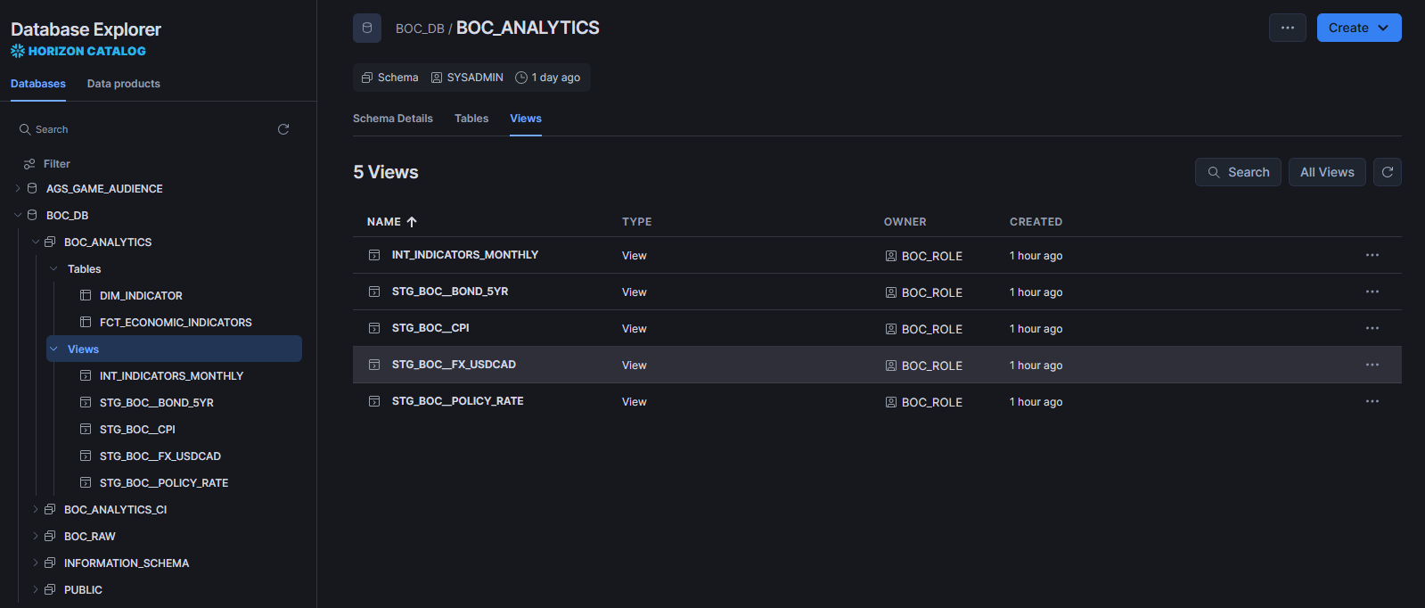
BOC_DB.BOC_ANALYTICS, all 8 tests green.
Orchestrated with Airflow
A local Apache Airflow stack (Docker Compose, LocalExecutor + Postgres) runs
the pipeline on a schedule: one DAG, ingest_raw → dbt_build,
@daily with retries and catchup=False.
dbt runs from an isolated venv baked into the image so its dependencies never collide with Airflow's, and it
targets an isolated CI dataset so scheduled runs never touch the dashboard's data.
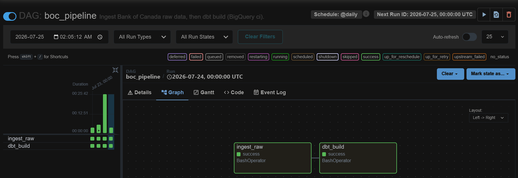
boc_pipeline run, both tasks green on the daily schedule.
The stack
Warehouse & transform
Ingestion
Orchestration
CI & delivery
See it live
Open in new tab ↗The Looker Studio dashboard, embedded below. Use the selector to switch indicators and drag across the chart to zoom into any period.